Standardize display of checkboxes in APEX
published on
We often encounter checkboxes in many data-driven applications. Especially in APEX they are often used. And that is a good thing. But the problem we're talking about here is choice. The problem of having to choose one option. Many developers just take any icon. This leads to an inconsistent UI.

Therefore it is important to define an application wide standard how to use these checkboxes. Of course, you can specify which ICON should be used for one value and which for the other. But even this is a choice that the developer has to make every time, now by guideline, but still by himself.
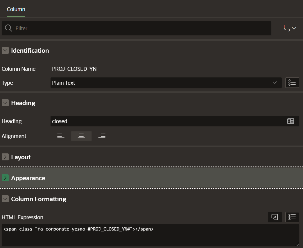
It is easier with the help of CSS. For fields or columns that can always take fixed values, like yes and no, we can simply define two classes that take an icon from FontApex. As a result, we will always be able to use the following snippet in APEX as HTML expression of such a column.
<span class="fa corporate-values-#COLUMN_NAME#"></span>As suitable CSS we define the following pseudo element:
.corporate-values-yes:before {
  content: "\f14a";
}

.corporate-values-no:before {
  content: "\f096";
}
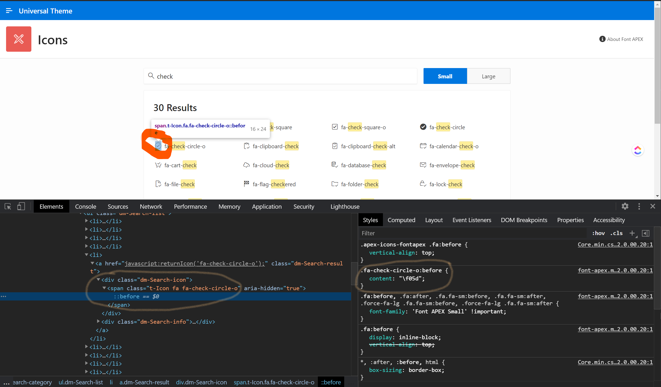
The Unicode value of the characters to be displayed can be determined via the Chrome Developer Toolbar or via the definition gei Github: https://github.com/oracle/font-apex.

Now the developer knows how to implement such a checkbox and does not need to worry about the layout. Even in an interactive report you can use this method and get the advantage that the column value can still be used as a filter.
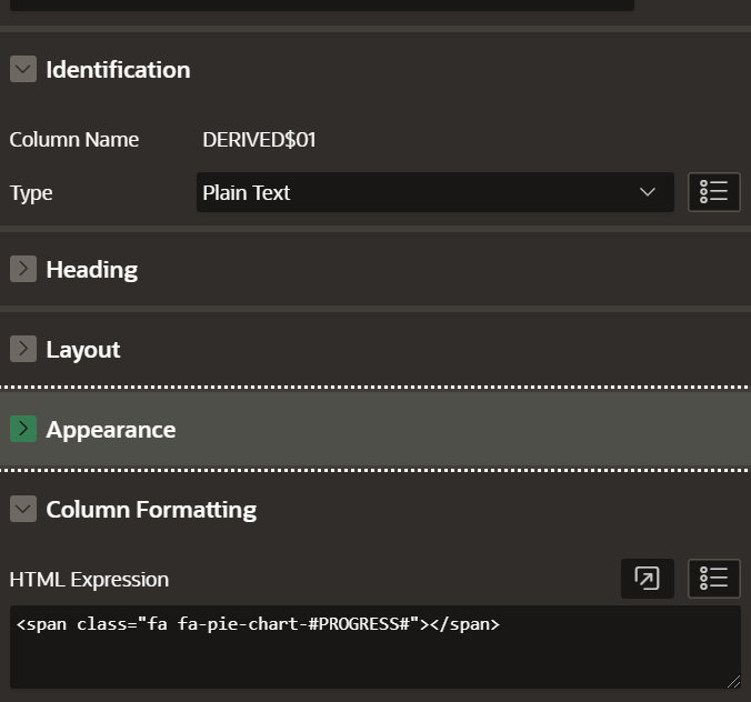
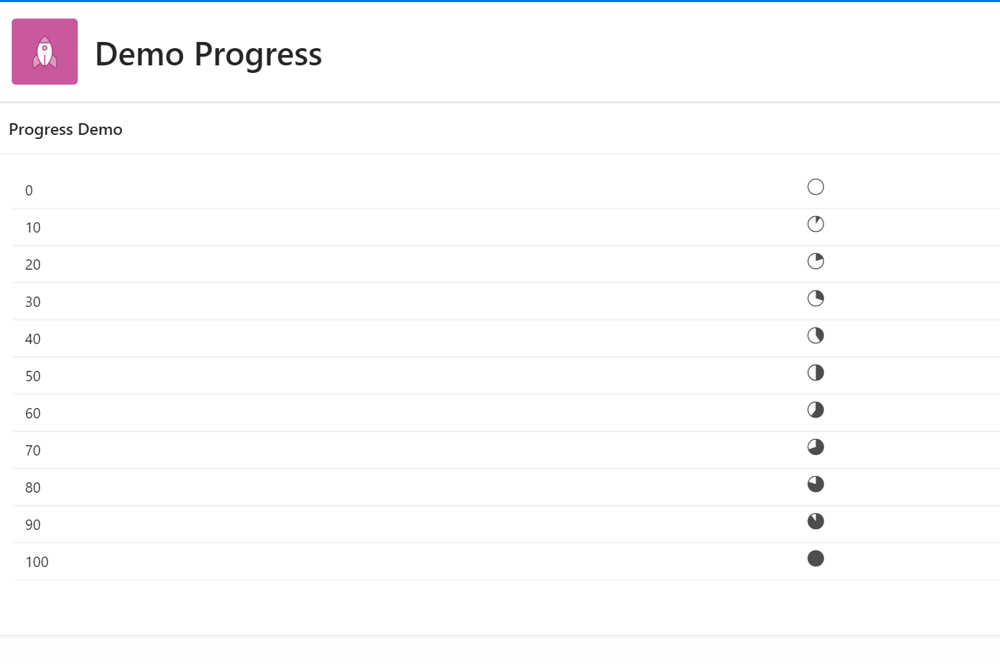
This method is not only bound to checkboxes. Any kind of fixed values can be handled this way.
with example_progress as (select (rownum-1) * 10 progress
                            from dual
                         connect by rownum <= 11)
select progress
from example_progress 
