Optimal amount of columns in a card report
published on
I often create card reports in my projects. These reports are about showing the data on cards. Depending on the use case, it doesn't always make sense to show this data in tabular form. That's what cards are for. Especially in a mobile environment, i.e. on a mobile phone or tablet, it makes sense to display the cards.
However, it can sometimes happen that there are so few data records that the display on the monitor or tablet is not fully utilized. For example, if you define that there are always 4 columns in a card report, and you unfortunately only have two or three cards in the display. This makes the layout of the page asymmetrical and often looks strange.

Wouldn't it be practical to utilize the full width in such a case?
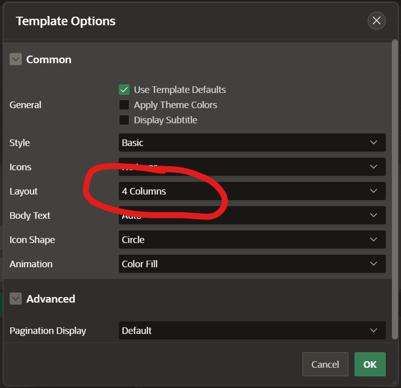
With a little CSS hack, this is easily possible. In the example above, the report is designed to have 4 columns.

This leads to the following CSS rule being used in the Universal Theme:

This rule must therefore be overwritten. For example, if you define the number of columns in such a way that it fits optimally. You can divide the number of records by 4, 3 or 2. If there is no remaining number, this would be the optimum number of columns. If there is a remainder, the number with the largest residual value could win.
If you have this value, you overwrite the above rule using apex_css.add and placing this call as a page process to be executed before headers.
apex_css.add (
    p_css => '@media (min-width: 768px) {
                .t-Cards--4cols {
                  grid-template-columns: repeat('||:P10_MAX_CARDS_PER_ROW||', 1fr) !important;
                }
              }',
    p_key => 't-Cards--4cols' );
}
And then you can make sure that the rows of cards are optimally filled.

You can find a demo here: https://apex.oracle.com/pls/apex/r/die21/demos/variable-cards
Featured Image by Kelly Sikkema on Unsplash